Adding color-blind themes to Kubecolor to make Kubernetes more inclusive
![]()
Kubcolor is a thin wrapper over the kubectl command that adds coloring to the output.
I cloned the project and started maintaining it back in 2022 when the original author wasn’t active anymore.
KubeColor can reformats the output of most kubectl commands to add colors and clarity. It makes it so easier to read the output that I still don’t understand that it’s not more widely used. I actually gave a lightning talk about it at the KubeCon’s Cloud Native Reject Europe 2024 in Paris if you want a video pitch.
One of the longest requested feature, discussed at length in the previous project, was to be able to cusotmize the color theme used by KubeColor.
Actually, when I first cloned the original project, I applied a patch that was globally changing the colors to make thinks less colory and more standard, limiting to a smaller set of colors. Some people started complaining right away, but that’s what people do anyways.
As of version 0.3.0, kubecolor now supports custom color scheme and theme, thanks to the work of other main contributor, AppleJag, which is a talented (Go) devleoper. Jag, I can’t thank you enough for all the help on this project.
What’s the problem ?
By default kubecolor uses the set of colors from your terminal’s config, so it always was possible to configure it. Just change the theme of your terminal and you can adapt the colors to your needs !
But more than colors default colors, some want to colorize some specific fields differently, or use more colors to further differenciate things.
But there’s more…
According to this article, one man out of 12 have some sort of color blindness (or color disability). Women are a little less concerned, with one out of 200, but still, it’s a lot ! (numbers may vary depending on the website too…)
Check the Wikipedia page to learn more, and there’s tons of other sites about this matter. And still, it’s usually not something we think of right away.
For example, just look at my blog, with it’s low contrast grey colors and you’ll understand that color blindness was not my main concerns at the time.
And, well, when we think at inclusion it’s generally genders and skin colors, and when we think about accessibility, it’s mobility impairement, deafs and blinds.
Color-blindness is usually not mentionned or taken care of. The CNCF Website itself does not mention it directly. The only TAG (Technical Advisory Groups) in the Accessibility section is focused on hearing issues.
Maybe because it’s easier to live with color-blindness, or because people don’t talk about it by shame, it’s still a real problem and the numbers are huge, far more that what I always belived.
Note that I’m not trying to rate any of those against the others, or trying to speak in place of the impacted persons. I’m not impaired and I just want to put some light on inclusivity.
So, what to do with this ?
As soon as kubecolor got the color theme functionnality, I started thinking of adding one or multiple color themes for the various kind of color-blindness.
The first question that came to my mind was :
It’s quite usual to use
greenfor good things (success) andredfor bad things (errors). But is there a common pattern for color-blind persons ?
Well, so far I don’t have the answer. But while searching I learnt few things:
- Color is important, but so is the
contrast - there’s also modifiers like bold and italic that can help better differenciate things
- it is usually better to add some text explaining the status and not only rely on the color. Here, no probleme for us, as we are adding colors to an already expressive text.
- Maybe I should not add a theme at all and each person will built its own
Understanding KubeColor Themes
Thanks to Jag, kubecolor can process many kind of definitions to configure the colors.
In short:
-
using a regular color names (like red, blue) will use whatever is defined in your
terminalapplication’s theme.whitemay be white, or not, but if you already have a theme made for color-blindness, you may not have to change anything. -
using many other ways to define colors, like HEX and RGB values, will allow to use custom colors not part of your terminal’s theme.
-
using
bg=orfg=will allow to change the background or the front (text) color. -
it is possible to use any of the
modifierslike bold, italic and so on to even better tune the visibility of each field. -
thanks to all the
KUBECOLOR_THEME_*ENV variables, it is possible to fully customize the output of “each” field, depending on the original command used againstkubectl(likegetor adescribe). -
it is possible to create the theme as a file, which also enable sharing it, by creating a
~/.kube/color.yamlfile (in OsX and Linux, may be a different location on Windows). We’ll dive on the format later, keep reading. -
kubecolorembeds default themes, both in dark and light mode:- dark
- light
- pre-0.0.21-dark: the previous color schema from the original project
- pre-0.0.21-light
- dark
You can check the content of each basic theme in the code in the config/theme.go file.
How to build a theme
As said earlier, you can either use the KUBECOLOR_THEME_* env variables or create your theme in the ~/.kube/color.yaml file.
Using ENV Variables
The easiest is to check the docs at https://github.com/kubecolor/kubecolor/blob/main/README.md#color-theme and experiment.
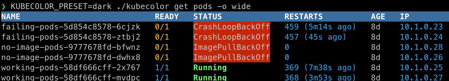
In any case, you have to pick a base theme, by setting KUBECOLOR_PRESET, then update some of the colors. For example you can change all the running pods to blue with:
KUBECOLOR_THEME_BASE_SUCCESS=blue KUBECOLOR_PRESET=dark kubecolor get pods -o wide

Using the config file
Create the file ~/.kube/color.yaml and add some content like:
preset: dark
theme:
  table:
    header: fg=red:bold:bg=blue
So basically, you take the ENV variable and you nest the last part of it.
With KUBECOLOR_THEME_STATUS_ERROR, you remove the KUBECOLOR part, so the final path is theme.status.error, so to show pods in error in pink:
preset: dark
theme:
  table:
    header: fg=red:bold:bg=blue
  status:
    error: pink

Color Blind Theme
First I want to clearly state I do not have any color impairement, and the work I’m trying to achieve here is based on articles I read and some talking with color-blind persons. There’s no scientific work on my side.
The idea is to provide an out of the box solution to help people with color-blindness. The outcome may not be perfect or even useful and I take no responsability. It’s best effort. It’s OpenSource. Bare with me.
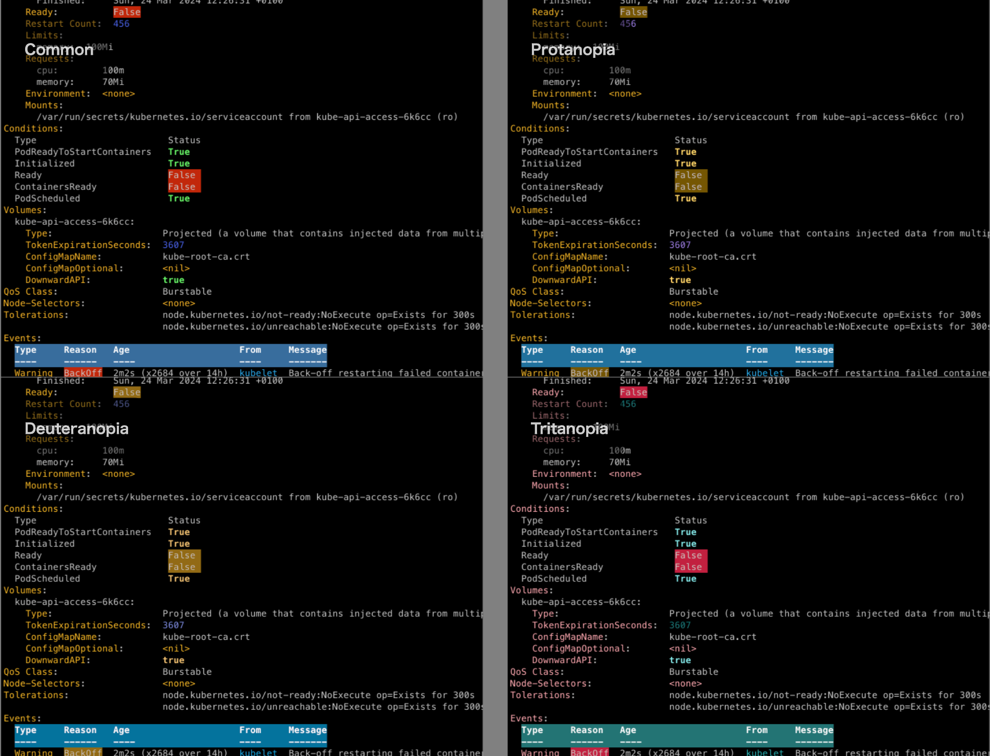
After some researches, I found the Cromatic Vision Simulator website which allows to load an image and, using a quad view, see what color-blind persons may see depending on the kind of disability.
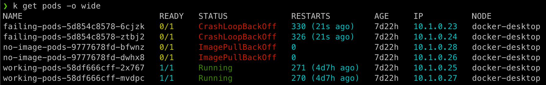
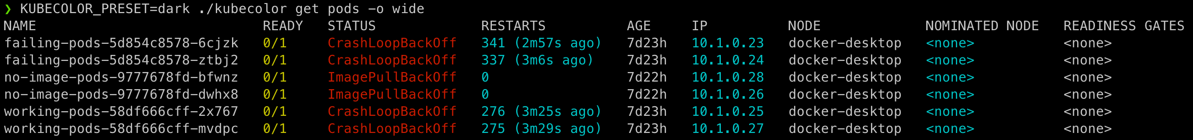
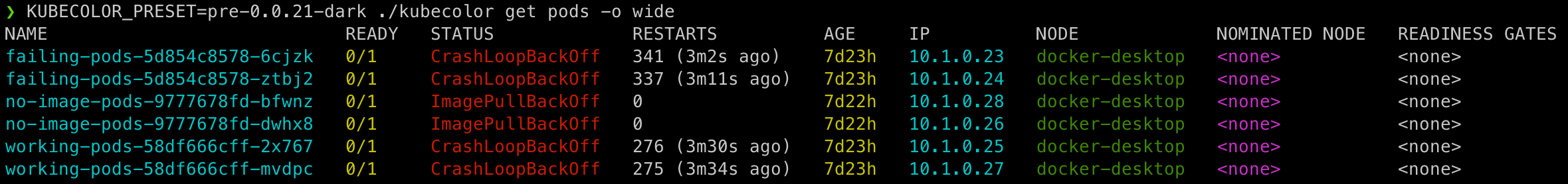
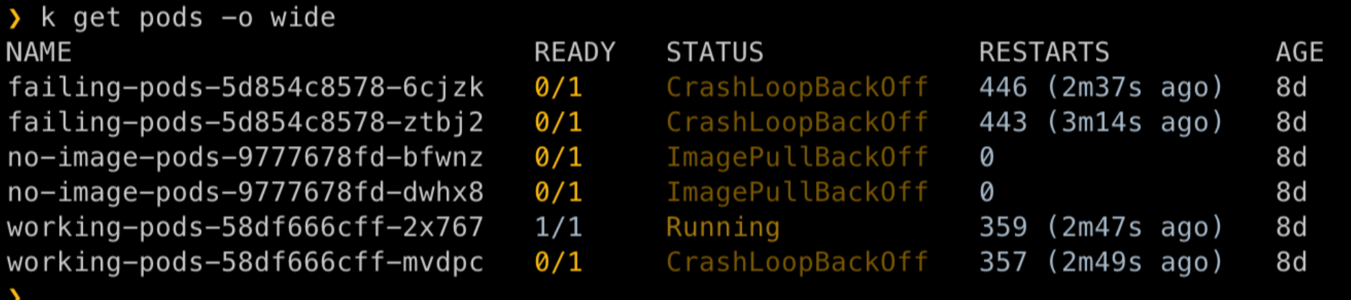
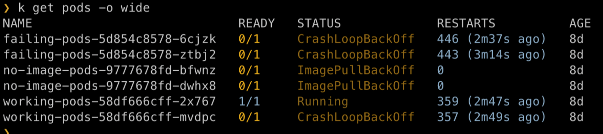
In short, if I upload one of the previous images that captured the k get pods -o wide commands, we can check how it look using the dark theme:
- regular view
- Protanopia view
- deuteranopia view
- tritanopia view
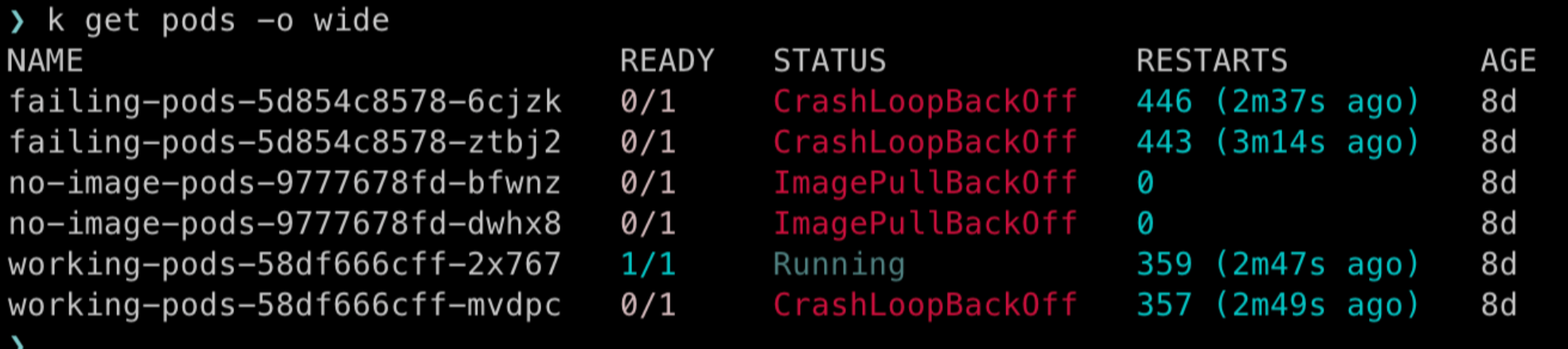
Now I guess we all understand the issue with the current color scheme of the dark theme: any impaired person will lose most of the color informations. At this point, better use plain kubectl commands…
So I tested some chromatic progressions to try to identify a palette that could work fine at least most of the time:
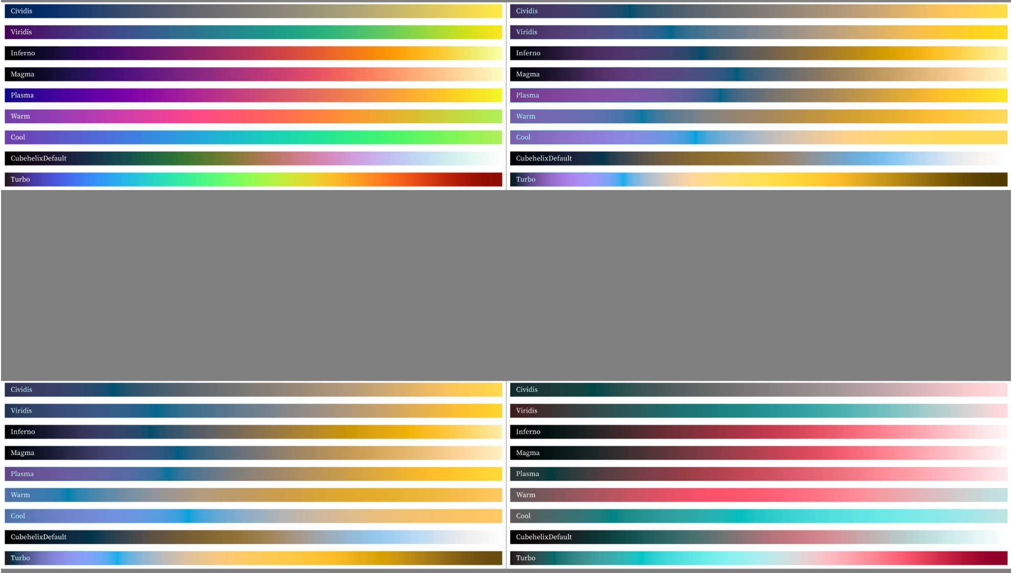
Being color-blind is not just not seeing green or red, there’s also quite a limitation in the color hues that are perceived, so everything from green to red, where the color changes slowly for a regular eye, will be almost the same brown/yellowish for a Protanopian.
My final conclusion is that it seems possible to achieve a theme that will help better differenciate the content. What we need here is having different color hues to show the difference of, mostly, good and bad situation, and color cycles when there’s a table.
Using the Observable HQ website, I used the discrete 10 schema to cut the rainbow in 10 usable colors:
-
#23171b -
#4860e6 -
#2aabee -
#2ee5ae -
#6afd6a -
#c0ee3d -
#feb927 -
#fe6e1a -
#c2270a -
#900c00
Once rendered, we have:
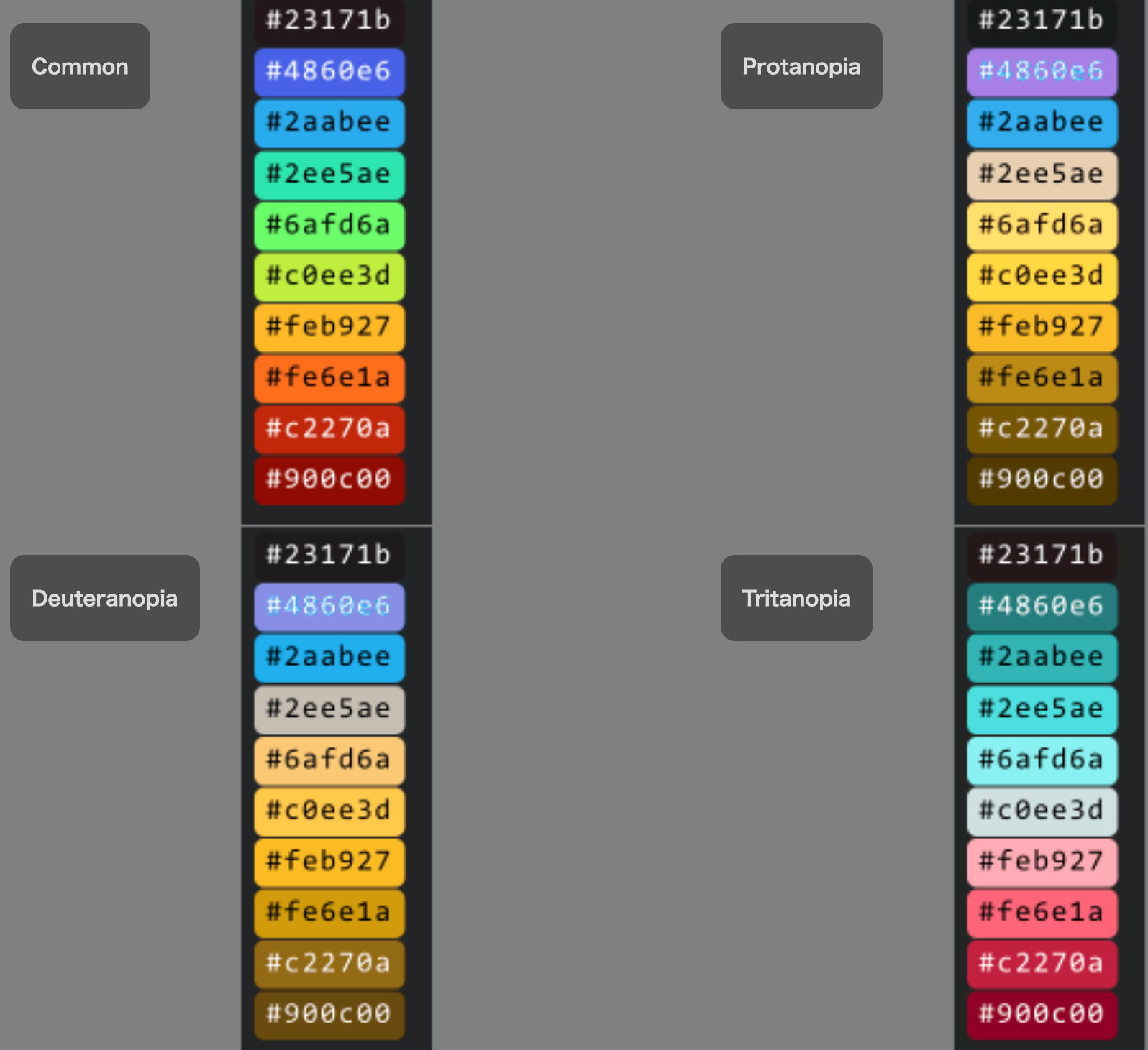
The dark theme only uses 6 colors (well, 5 as one if the default white for dark theme, or black for light theme). So here’s my selection:
| Terminal Color | Matching Color | protanopia | deuteranopia | tritanopia |
|---|---|---|---|---|
yellow
|
#feb927
|
#f9bb27
|
#fbbc23
|
#ffacb6
|
magenta
|
#4860e6
|
#a77fe5
|
#888ee4
|
#257e7d
|
green
|
#6afd6a
|
#fee16c
|
#fee16c
|
#fee16c
|
red
|
#c2270a
|
#bb8b16
|
#936a15
|
#ff6579
|
cyan
|
#2aabee
|
#34adee
|
#22afef
|
#34b4b5
|
| Null color (white-ish) |
#2ee5ae
|
#e8d0b0
|
#c6beb3
|
#4ddfe0
|
I also used the bold on the success and I actually inverted the error so the background is red and the text is white. High contrast is usually a good helper where we’re limited with the possible colors.
The result seems to be pretty much working in all situations:
Using the themes
Finally, along the other 4 themes announced before, you can now use any of the new themes if you’re concerned by color blindness. They are:
- protanopia-dark
- protanopia-light
- deuteranopia-dark
- deuteranopia-light
- tritanopia-dark
- tritanopia-light
Just set your env variables like:
KUBECOLOR_PRESET=protanopia-dark kubecolor get pods
or
export KUBECOLOR_PRESET=protanopia-dark
kubecolor get pods
Or set it in your config file ~/.kube/color.yaml like:
preset: protanopia-dark
Updating the theme
As the Themes are pretty much a first iteration and a work in proress, please, feel free to comment and open an issue if you feel the current themes can be enhenced.
Also, you can start creating your own theme, by modifying an existing one, then share it either in a issue or a Pull Request.
Simply start from original theme file and add more customization to the ~/.kube/color.yaml file:
preset: protanopia-dark
theme:
  base:
    key:
       - fg=#feb927
       - fg=white
    info:
    primary: fg=#4860e6
    secondary: fg=#2aabee
    success: fg=#6afd6a:bold
    warning: fg=#feb927
    danger: fg=white:bg=#c2270a
    muted: fg=#feb927
  options:
    flag: fg=#feb927
  table:
    header: fg=white:bold:bg=#2aabee
  status:
    error: fg=white:bg=#c2270a
Note that, at the moment, all protanopia, deuteranopia and tritanopia themes are the same. Please, when you leave a feedback, mention your condition, so we can update the themes differently to better suite each of the different situations.
I would encourage you to set your default theme according to your type of disability to benefit of the futur changes.
Wrapping it up
Next time you see the screen of a co-worker using strange colors, don’t smile or make fun, this person is probably suffering some sort of color blindness. Instead, just explain them that KubeColor is now your friend.
Even worse, the next time you see someone using kubectl in monochrome, insist for them to go check Kubecolor !
We put a lot of effort into this feature. We trully hope that it will help some persons out there and make Kubernetes more inclusive. If not, it was a good adventure.
Feature is available in Kubecolor v0.3.0, available now !